António Teixeira Lopes
Brand identity
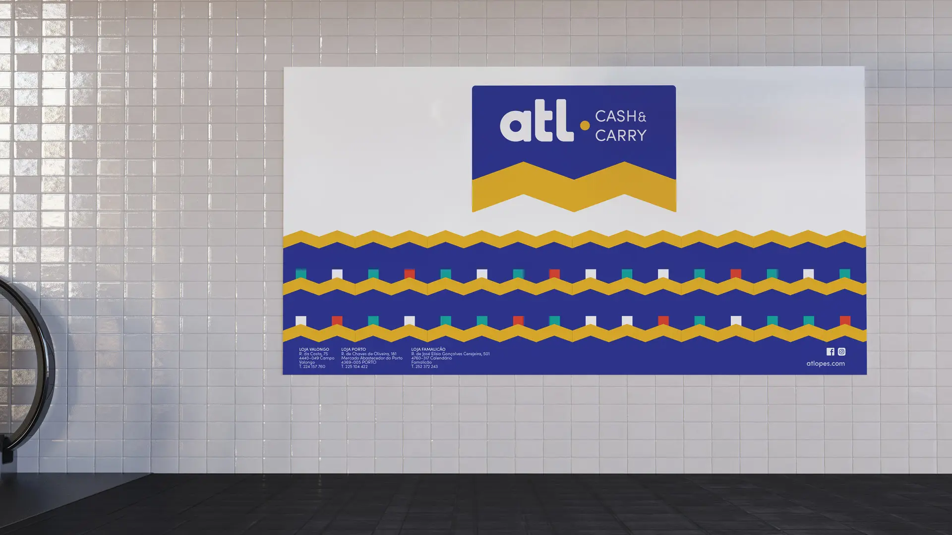
The basis for the brand identity of António Teixeira Lopes (atl) has as its main idea the partnership created with more than 400 shops that are the nucleus of the company.
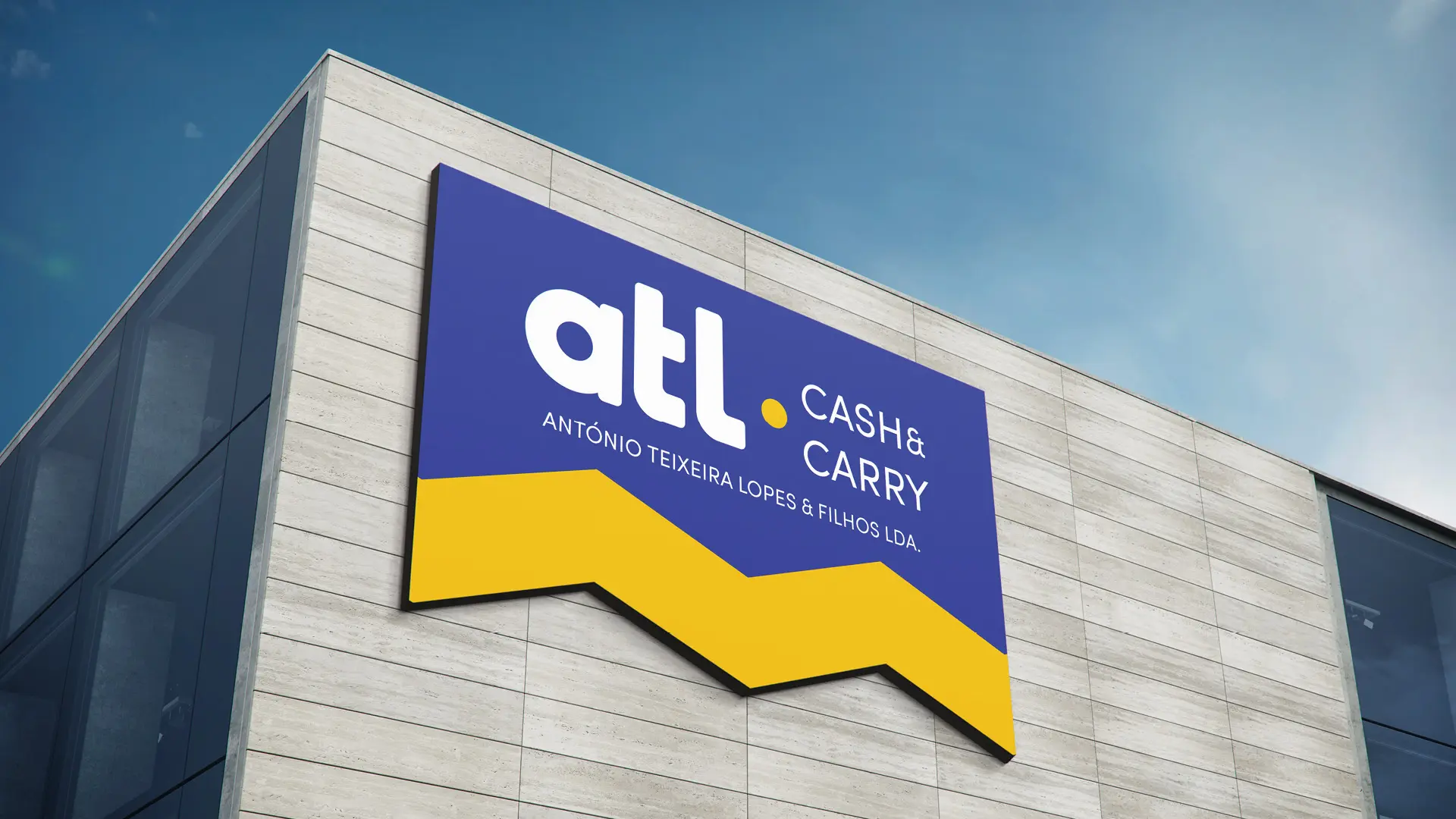

We symbolise the idea through a roof that is at the base of the brand. The upper box symbolises the mother house and blue is chosen as a symbol of security. The lower case and slightly rounded letters were chosen because they appeal to the proximity with the client.